Navigation Bar
There are two kinds of navigation bar currently supported by our tool, bottom navigation bar and top bar.
The bottom navigation bar provides quick navigation to each of the main tabs which should represent the core views of the application.
For all other screens our tool automatically generates a top bar, which can be used to return to the previous view. The top bar can be easily removed by a developer, if need be.
Example
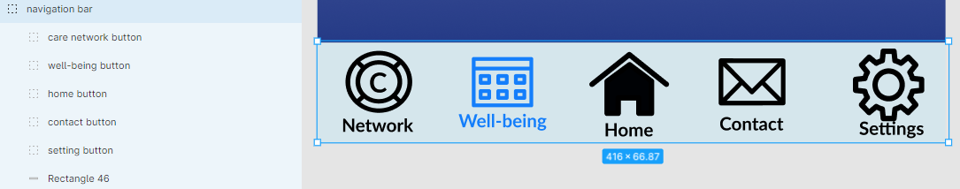
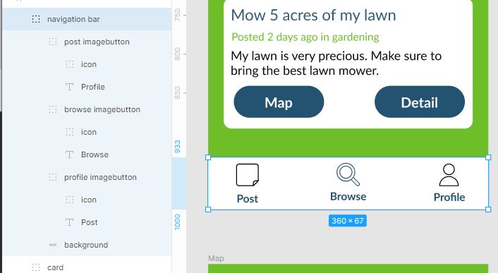
Bottom Navigation Bar
Top Navigation Bar
Bottom Navigation Bar
Structure
-
Bottom navigation bar should be a group containing a reasonable number (2-6) of buttons representing links to other screens through
onTapinteractions. Any button that is without anonTapinteraction is considered to be representing the current screen. -
The buttons within should contain an image/picture/icon and text representing the screen they are linked to.
Styling
The navigation bar can be styled through a background element like most other components.
Naming & Grouping
- The entire navigation bar should be organized into a group and its name should contain
navigation. - The buttons within the navigation bar should be of the type Group and have names that contain the word
button. - The text within the navigation button has no restrictions.
- Similar to component ‘image button', images within the navigation button should be named with one of the following three words within:
image,iconorpicture. - The images within the navigation button have no special type restrictions. You can add vectors, bitmaps or texts as you like into the image group within the navigation button group.
Example of Structure, Naming & Grouping
Pay special attention to the navigation bar and consider it carefully as it plays an important role within the app and also is by far the most complex component that we can generate. Designing it well can save hours of valuable development time.