Dropdown
Dropdowns are commonly used to let a user select a single option from a list of options.
Their native implementation on iOS and Android varies. Therefore, we implemented a completely custom dropdown that behaves consistently on both platforms and yet is close to the feel of the native ones.
Example
Example dropdown design in Figma, alongside its structure:
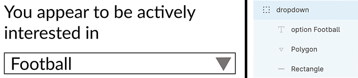
(Left) Figma Designed Dropdown (Right) Grouping of layers
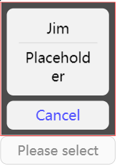
Example of Placeholder Option
Structure
A dropdown should be a group that contains a rectangle representing the container and a text component representing an option. (See examples above.)
Styling
Both the rectangle and the text option can be styled and their styles should be translated into code.
Naming
- The name of the dropdown selector's group should contain
dropdown. - Inside the group there should be a text element with a name containing
option.