Card & Form
The philosphy behind card & form
Cards are a common element in modern interface design. They are used to group elements that belong together and often define a section of a view that should be visually separated from the rest.
Our tool looks at cards as a grouping container with certain visual properties (background color, padding, etc.) that is used to wrap other components that are showed within.
A very similar example is a form, which would be typically used to group multiple input elements. Our tool treats cards and forms in exactly the same way - as a container.
Examples
An example of a form and its structure within a Figma File.
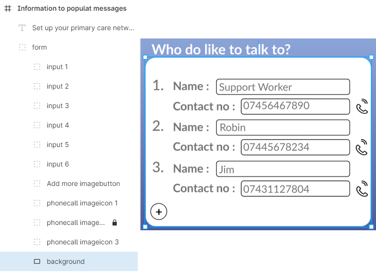
(Left) Grouping of layers (Right) Figma Designed Form
An example of a card and its structure within a Figma File.
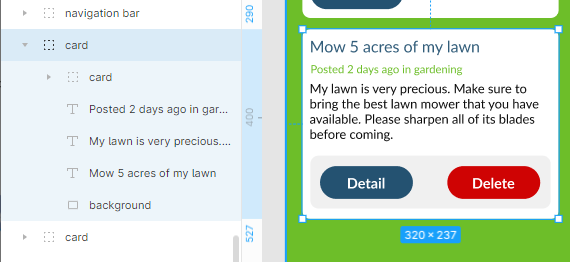
(Left) Grouping of layers (Right) Figma Designed Card
Structure
The whole card/form should be a Group that contains any elements that it should encapsulate (see examples above).
It can contain almost any other components inside, such as:
- Text buttons / Image buttons
- Charts
- Dropdowns
- Images
- Input Fields
- Sliders
- Switches
- Cards/forms
- Basic figma elements such as Text, Rectangles, Ellipses, etc.
Cards/forms can contain other nested cards/forms inside, which enables rich and complex layouts to be built and converted.
Currently, the only component that cannot be nested inside is the bottom navigation bar due to its unique function.
Styling
A card or a form can optionally contain a rectangle or a vector as the bottom layer inside its group (see examples above) called background. If present, this will define its background color, corner and border styling.
Naming
A card/form should contain either of the words card or form within its name to be treated as such. All nested components follow their respective rules.