Input Field
Input fields allow users to enter user input. Typically they are used within forms, search boxes, to send messages and more.
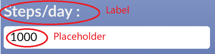
Example
Example of an input field
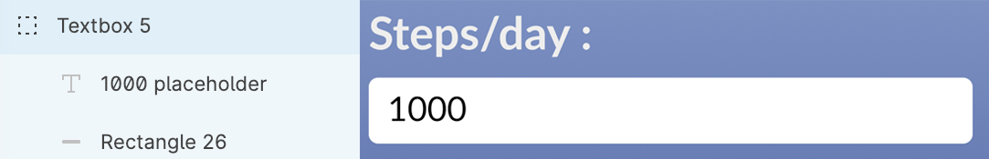
Structure
- An input field should be a group that contains a Rectangle that represents its container.
- (Optional) Can contain Text representing a label.
- (Optional) Can contain Text representing a placeholder.
Example of Input structure
Styling
- Any styles of the container (Rectangle), such as background, border, corner radius, etc. will be translated into code.
- Any text styles applied to the optional label and placeholder will be also translated into code.
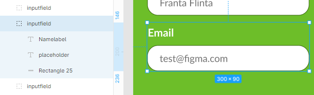
Naming and Grouping
- All the elements within the input component should be contained within a group with a name that contains
input. - Label text should contain the word
labelin its name. - Placeholder text should contain the word
placeholderin its name.
Example of How Label and Placeholder looks on the frontend