Button
Buttons are divided into text button and image button.
Text Button
Examples

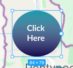
Examples of Text Button Apperance
Styling
A Figma element composed of a shape (rectangle or circle) and text.
Naming & Grouping
- The text button should be a group.
- The group name should contain the word
textbutton. - Besides text, the groups are also required to contain a rectangle or a cricle (we only support these two shapes right now).
Image Button
Examples

Examples of Image Button Apperance
Styling
A Figma element composed of graphics (or group of shapes) without text.
Naming & Grouping
- The image button should be a group.
- The group name should contain the word
imagebutton. - The image button group should have a sub-component with its name containing one of the words
image,iconorpicture, this component will be downloaded as the image.
The image sub-component can be a single bitmap/vector image or even a group of any other elements (such as multiple vectors that collectively form an image). In the latter case, this tool will download and render the entire group as a bitmap.